This covers everything you need to shape what appears on each page of your store: adding content sections, filling them with items (blocks), putting things in the right order, and removing what you don't need.
Every page has the following structure:
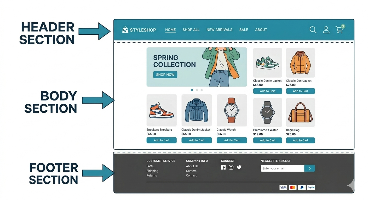
- Header is the bar at the top of every page — typically contains the store logo, navigation links, and cart icon.
- Footer is the bar at the bottom of every page — typically contains links, policies, and contact information. Both appear on every page and contain their own sections.
- Canvases make up the body of the page — the area between the header and footer. They are defined layout regions created by the theme developer. Each page has one or more canvases, and each canvas holds its own set of sections. For example, a home page might have a Canvas Left Panel and a Canvas Right Panel, edited independently.
- Sections sit inside a canvas (or the header/footer) and are stacked vertically: a hero banner, a product grid, a testimonial row, and so on.
- Blocks are repeatable items inside a section: individual slides in a carousel, or cards in a feature grid.
The configuration panel shows your page's full structure — Header, canvases, and Footer. The configuration panel shows the settings for whichever area you select.
The editor supports three types of pages:
| Page Type | What It Is |
|---|---|
| System pages | Built-in pages that are part of every store (e.g., Home, Product Detail, Cart, Checkout). These pages cannot be created or deleted — only their sections and content can be edited. |
| Custom pages | Pages created by theme to serve specific purposes (e.g., Sitemap in Turbo theme). |
| Section pages | Blank pages built entirely by adding sections — no fixed canvas structure. Use these when a page needs a fully custom layout from top to bottom. |
- In the design panel, click Add Section Page.
- Enter a Name for the page (shown in the editor).
- Enter a Slug — the URL path for the page (lowercase letters, hyphens only, no special characters). The page will be accessible at
{domain}/sections/{slug}— for example, a slug ofsummer-saleresults in{domain}/sections/summer-sale. - Optionally, select an existing section page to copy its sections as a starting point.
- Click Create.
The new page opens in the editor. Add sections to it as you would on any other page.
Tip: Section pages include a header and footer by default. These can be toggled off in the page settings if the page needs a fully standalone layout.
The Header and Footer span every page of your store. Clicking either in the configuration panel opens its settings in the configuration panel.
To customize the header or footer, add, reorder, and remove sections within them just like any canvas. Changes apply across all pages.
Sections can be added to any canvas, the Header, or the Footer. The steps are the same regardless of where you are adding.
The section browser can be opened in two ways:
- From the live preview: hover between two existing sections (or at the top or bottom of the canvas). A + Add Section button appears — click it.
- From the configuration panel: In the canvas, Header, or Footer, click the Add Section button.
Once the section browser is open:
- Search by name, or browse by category:
- Theme: sections built into your active theme (e.g., hero images, application banners, testimonials)
- Library: shared sections available across themes (e.g., locate us)
- Extensions: sections from third-party apps you have installed (e.g., product recommendations)
- Hover over any section name to see a preview (desktop, tablet, and mobile views cycle automatically).
- Click a section to add it at that position.
Tip: Use the search box to quickly find a section by name — results filter as you type
If you know what you want but don't see it in the library, describe it in plain language and AI will generate it.
- In the section browser, click Generate Section with AI at the top.
- Describe what you want in the prompt field, for example:
- "A full-width banner with a bold headline, subtitle, and two side-by-side buttons"
- "A 3-column grid of icons with headings and short descriptions below each"
- "A dark-background testimonial carousel with customer photos and star ratings"
- Optional: attach a reference image: click the attachment icon and upload a screenshot or mockup. The AI uses it as visual guidance.
- Click Generate. Review the result in the preview.
An AI-generated section has two parts:
- Data source — where the section pulls its content from. The AI connects the section to the right data source based on your description.
- HTML — the actual markup and layout of the section, generated by the AI and fully editable.
Pulls live data from an external service over the internet.
Example: Show live shipping rates, stock levels from a warehouse system, or prices from a third-party pricing tool.
To add:
- Data Key — a unique identifier for this data source (letters, numbers, underscores only — e.g.,
shipping_rates). - Data Value — the REST API endpoint URL.
Queries the storefront database directly for exactly the data needed — more flexible than REST as it returns only the specific fields requested.
Supports two types of variables:
- Static Variables — fixed key-value pairs always sent with the query (e.g., a hardcoded category ID). Set once during configuration.
- Dynamic URL Variables — values pulled from the current page URL at runtime. Can be mapped from path parameters (e.g.,
/products/shoes) or query parameters (e.g.,?brand=nike). Dynamic variables take priority over static ones when both are set.
Example: Build a custom product listing section that shows only name, price, and stock status. Use a static variable to fix the category, or a dynamic URL variable to filter by whatever category is in the current page URL.
To add:
- Data Key — a unique identifier for this data source (letters, numbers, underscores only — e.g.,
product_list). - Data Value — the GraphQL query.
A way to supply structured content directly in the data source — written as key-value pairs (e.g., "city": "Mumbai"). Useful for static content that doesn't change often and doesn't need to be fetched from an external service.
Example: A section listing store locations, each with a name, address, phone number, and opening hours defined directly in the data source.
To add:
- Data Key — a unique identifier for this data source (letters, numbers, underscores only — e.g.,
store_locations). - Data Value — the JSON content.
- Dynamic Field in Editor — when enabled, the JSON can be edited directly from the section configuration panel. Set a Configuration Name (the label shown in the panel) and a Default Value (the pre-filled JSON when no custom value is set).
A simple list of repeating items, each with the same fields.
Example: An FAQ section with question-and-answer pairs, or a features list with an icon, heading, and description for each item.
To add:
- Data Key — a unique identifier for this data source (letters, numbers, underscores only — e.g.,
faq_items). - Data Value — the list items and their fields.
- Dynamic Field in Editor — when enabled, the list can be edited directly from the section configuration panel. Set a Configuration Name and a Default Value.
A single line of text that can be edited from the section settings.
Example: A customizable tagline or a button label.
To add:
- Data Key — a unique identifier for this data source (letters, numbers, underscores only — e.g.,
hero_title). - Data Value — the text value.
- Dynamic Field in Editor — when enabled, this text can be edited directly from the section configuration panel. Set a Configuration Name and a Default Value.
A single numeric value that can be edited from the section settings.
Example: A discount percentage shown inside a promotional banner.
To add:
- Data Key — a unique identifier for this data source (letters, numbers, underscores only — e.g.,
discount_percent). - Data Value — the numeric value.
- Dynamic Field in Editor — when enabled, this number can be edited directly from the section configuration panel. Set a Configuration Name and a Default Value.
An on/off toggle that can be switched from the section settings.
Example: A toggle to show or hide a "New" badge on a product card.
To add:
- Data Key — a unique identifier for this data source (letters, numbers, underscores only — e.g.,
show_badge). - Data Value — true or false.
- Dynamic Field in Editor — when enabled, this toggle appears directly in the section configuration panel. Set a Configuration Name and a Default Value.
A single image that can be swapped from the section settings.
Example: A background image for a hero banner.
To add:
- Data Key — a unique identifier for this data source (letters, numbers, underscores only — e.g.,
banner_image). - Data Value — the image file.
- Dynamic Field in Editor — when enabled, the image can be swapped directly from the section configuration panel. Set a Configuration Name and a Default Value.
A single video that can be swapped from the section settings.
Example: A product demo video embedded in a feature section.
To add:
- Data Key — a unique identifier for this data source (letters, numbers, underscores only — e.g.,
demo_video). - Data Value — the video file.
- Dynamic Field in Editor — when enabled, the video can be swapped directly from the section configuration panel. Set a Configuration Name and a Default Value.
Constructs a link dynamically by combining a base URL with variables.
Example: A "Shop Now" button that links to a filtered product listing based on the current page.
To add:
- Data Key — a unique identifier for this data source (letters, numbers, underscores only — e.g.,
cta_url). - Data Value — the base URL and any variables to combine.
- Dynamic Field in Editor — when enabled, the URL can be edited directly from the section configuration panel. Set a Configuration Name and a Default Value.
A single color value that can be changed from the section settings without editing code.
Example: An accent color for a promotional banner that needs to change each season.
To add:
- Data Key — a unique identifier for this data source (letters, numbers, underscores only — e.g.,
banner_accent). - Data Value — the color value.
- Dynamic Field in Editor — when enabled, the color can be changed directly from the section configuration panel. Set a Configuration Name and a Default Value.
A number within a set minimum and maximum, controlled by a slider in section settings.
Example: The number of products to display in a grid (e.g., between 4 and 12).
To add:
- Data Key — a unique identifier for this data source (letters, numbers, underscores only — e.g.,
grid_count). - Data Value — the minimum, maximum, and step values for the slider.
- Dynamic Field in Editor — when enabled, the slider is available directly in the section configuration panel. Set a Configuration Name and a Default Value.
The HTML controls how the section looks and is laid out. The AI generates it automatically based on the description given.
After generation, an HTML editor opens alongside the preview. A developer can use it to fine-tune the code directly. Any changes show up in the preview instantly.
If the generated HTML has errors, a Fix errors with AI button is available in the HTML editor to automatically detect and resolve them.
After generation, prompts can be used to further adjust the section. Prompts can be given at three levels:
- Overall level — a single prompt that updates the entire section at once (e.g., "Make the layout two columns instead of three")
- Individual data source level — a prompt targeted at a specific data source within the section (e.g., "Change the image source to use the product thumbnail instead")
- HTML level — a prompt targeted at the layout or structure of the section (e.g., "Add a divider between the heading and the button" or "Make the text left-aligned instead of centered")
Some sections contain blocks: repeatable items you can add, remove, and reorder independently.
- Select a section that has blocks (e.g., a carousel or feature grid).
- Click + Add Block in the section configuration or configuration panel.
- Choose a block type from the list. Block types are grouped by source:
- Theme: block types built into the active theme
- Library: shared block types available across themes
- Extensions: block types from third-party apps installed on the store
- Click a block type to add it.
This works the same way as generating a section with AI — describe what the block should look like and the AI builds it.
- Click + Add Block.
- In the block picker, click Generate Block with AI.
- Describe the block you want and click Generate.
- Modify the generated block manually or using prompts.
Sections and blocks can be given a custom name to make them easier to identify in the configuration panel — useful when a page has many similar sections or a section has many similar blocks.
- Click on the section or block in the configuration panel to open its configuration.
- Click on the name at the top of the configuration — it becomes editable.
- Type a new name.
Drag and drop in the configuration panel to change the order.
- Grab the drag handle that appears on the left when you hover over a section or block.
- Move it up or down.
- The preview updates in real time as you drag.
- Click a section or block in the design panel or directly on the preview.
- Its settings open in the configuration panel.
- Edit any field: text, color, image, toggle, etc. Changes appear on the preview immediately.
A global section is a master component that can be reused across multiple pages. Any changes made to a global section automatically apply to every page where it appears — useful for elements like promotional banners or trust badges that need to stay consistent site-wide.
To mark a section as global:
- Select the section in the configuration panel.
- In its settings, toggle Mark as global component on.
- Save the page. The section becomes a global reference — a single master that all instances share.
Note: Editing a global section affects all pages where it is used. To make a change on just one page without affecting others, unlink the section first by deleting the global reference for that page.
Hover over a section or block in the configuration panel and click the delete icon that appears. The item is removed from the page.
Each section has a built-in CSS input field in its section configuration. You can use it to apply custom styles to that section without touching any other part of your store.
- Select a section to open its section configuration.
- Scroll to the Custom CSS input field.
- Enter your CSS. The preview updates immediately to reflect your changes.
- Click Save to apply permanently.
The CSS applies only to that section.
- Write Your Content: edit and improve the text inside your sections.
- Control Who Sees What: show sections only on mobile, only to certain users, or only during a sale.
- Get Help from AI: ask AI for layout ideas or suggestions.