The Fynd Engage Dashboard serves as the central command center for your loyalty program. It provides a real-time, high-level view of your program's health, allowing you to track user acquisition, monitor point economics, and analyze engagement trends.
By leveraging these insights, sellers can make data-driven decisions to adjust reward strategies, identify peak activity periods, and ensure a balanced loyalty ecosystem.
At the top of the dashboard, you will find the Key Performance Indicators (KPIs). These metrics offer an immediate snapshot of the cumulative activity within your organization.
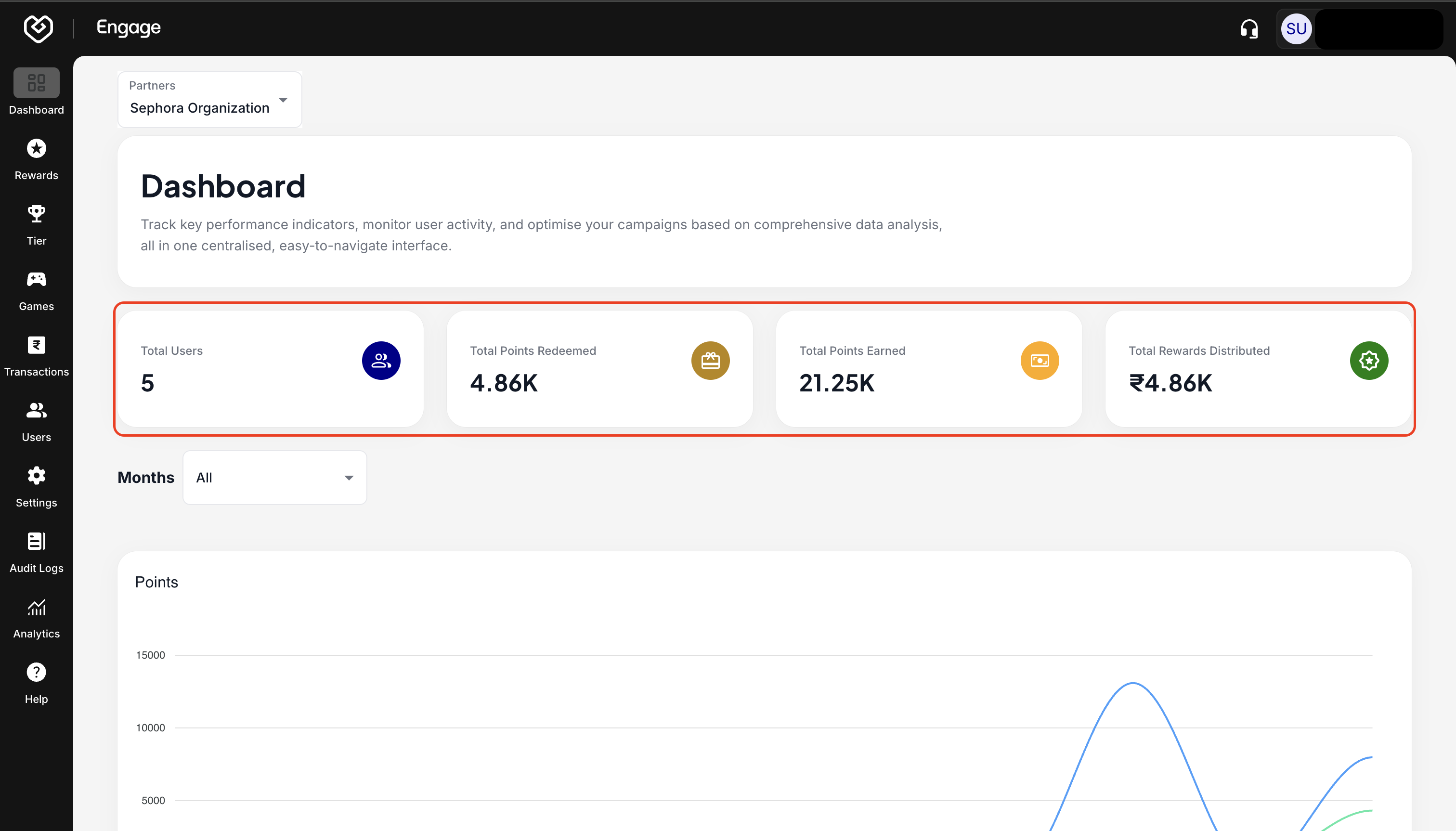
- Total Users: The total count of unique customers currently enrolled in your loyalty program. This indicates the reach and adoption of your program.
- Total Points Redeemed: The cumulative number of points that users have spent or "burned." A healthy redemption rate suggests high user engagement and perceived value of rewards.
- Total Points Earned: The cumulative number of points distributed to users through orders, sign-ups, or referrals. This tracks the "liability" or potential value users hold.
- Total Rewards Distributed: The total monetary equivalent (in your program's currency) of the rewards given to customers.
To analyze specific timeframes or isolate trends, use the filter controls located above the charts.
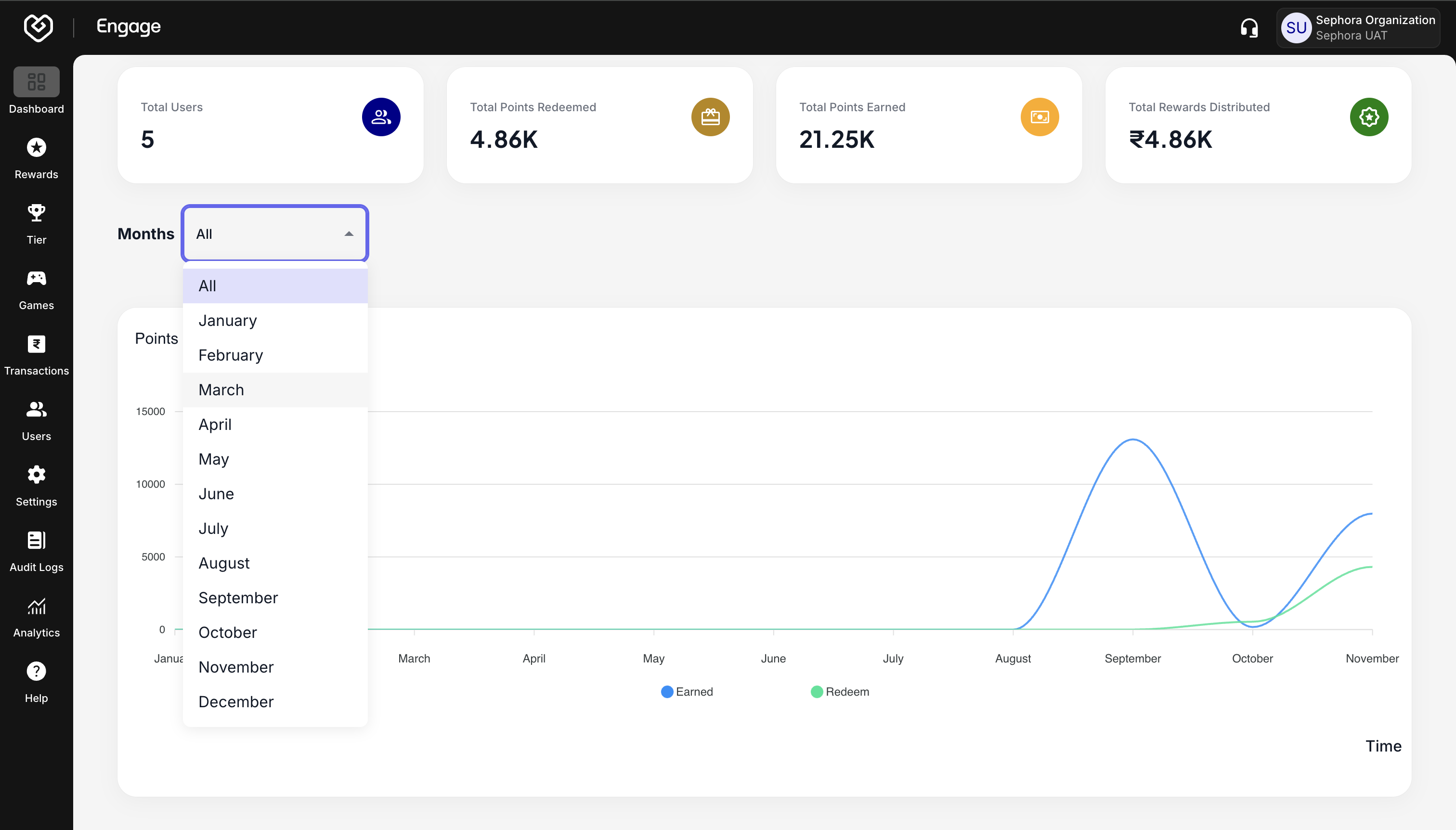
- Months Filter: By default, the dashboard may show aggregate data. Use the dropdown to select a specific month or a range of months. This is essential for comparing seasonal performance (e.g., holiday sales vs. regular months).
The Points Activity Chart provides a visual timeline of your program's economy. It plots the relationship between points issuance (Earned) and points usage (Redeemed).
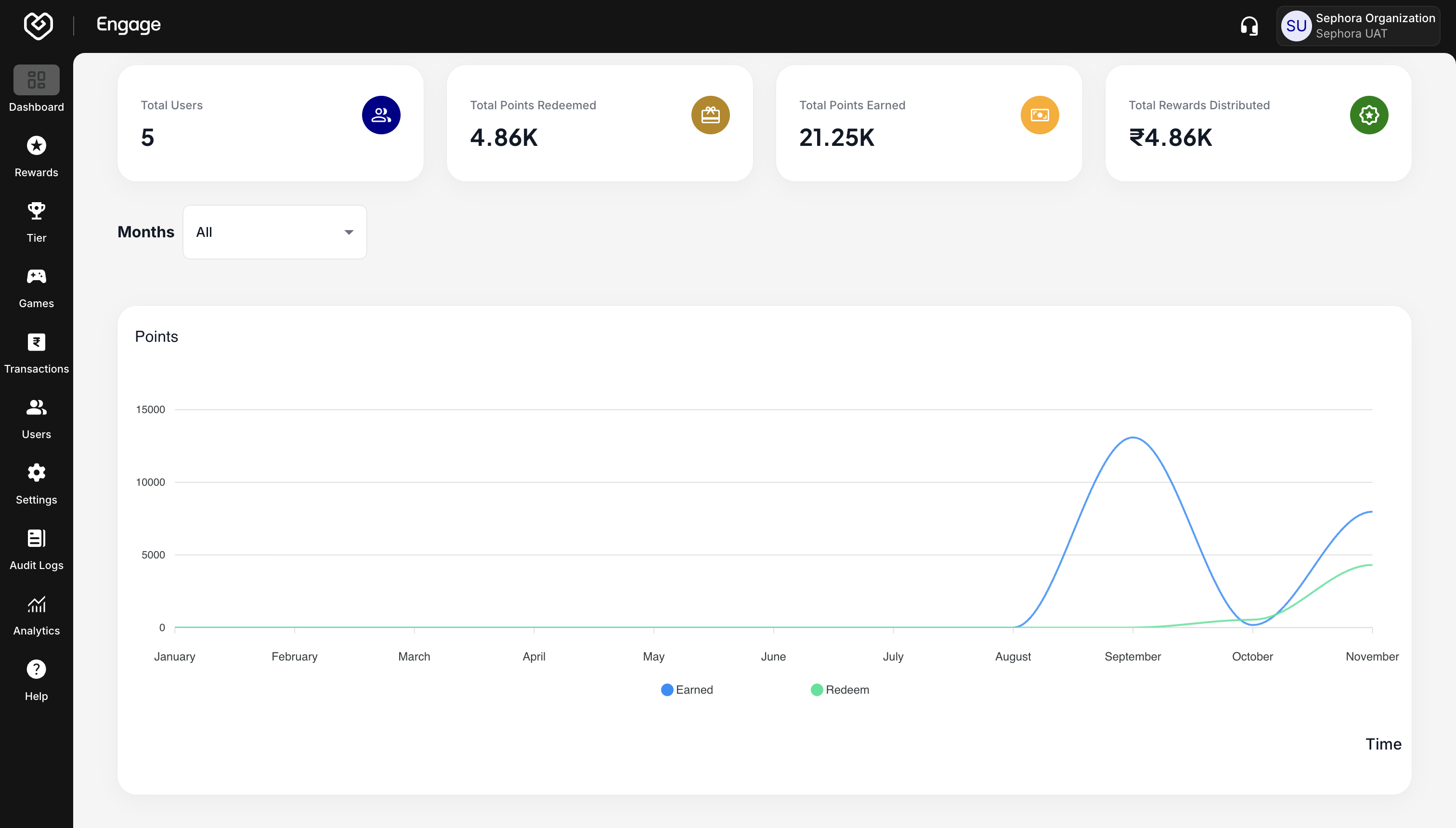
- Earned Points (Blue Line): Tracks the volume of points issued to customers over the selected period. Spikes here usually correlate with marketing campaigns or high-traffic sales periods.
- Redeemed Points (Green Line): Tracks when customers actually use their points.
- Interactive Tooltips: Hover your cursor over any specific node on the lines to view the exact point values for that specific date or month.
Ideally, the Green line (Redemption) should follow the Blue line (Earnings). If Earnings are high but Redemptions are flat, your customers may be hoarding points or finding it difficult to claim rewards